Mibo: Discoverability
The Problem
With adding more and more features to Mibo, we noticed in quantitive data there was a problem with discoverability of some core mechanics. People were not getting to these features which became a real problem in determining their effectiveness.
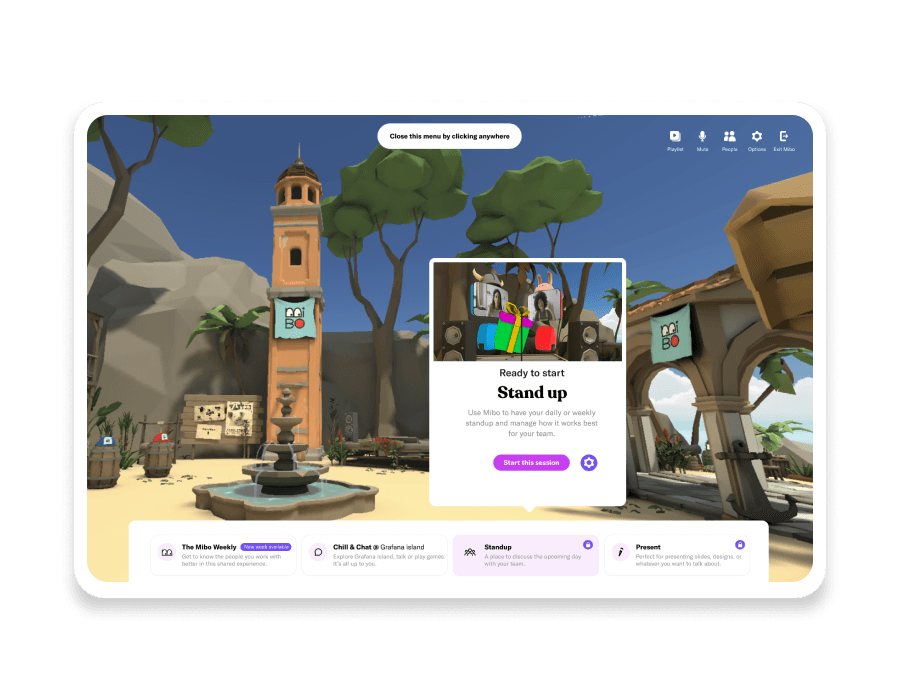
After some initial testing and user interviews (We mainly followed people during onboarding) we noticed a lot of the pain was in the in-game menu. It had worked fine until now, but with the added functionalities we were testing with, it had become convoluted.
We did a session with the team to map out the structure of the navigation and all it's components, and within 3 days launched a new version of the menu to quickly get an idea if it tackled the issues.

Results
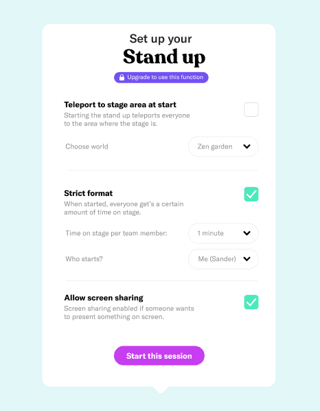
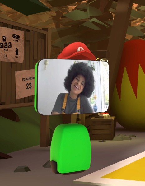
We did a lot of minor tweaking over time, especially in notifications throughout the user journey. But there was a lot less friction throughout the onboarding flow, and users found some of the features with a lot more ease. We are still tweaking this often, but here are some of the concepts and designs we build over time.
Site built in Framer
Copyright© 2022.


